Microsoft has released the consolas font pack for Visual Studio 2005 and 2008. The consolas font is a ClearType font - which is optimized for LCD display. (What is ClearType?).
My first impressions are - I do prefer consolas. But the real verdict can only be delivered after I have used it for a while.... which will come later.
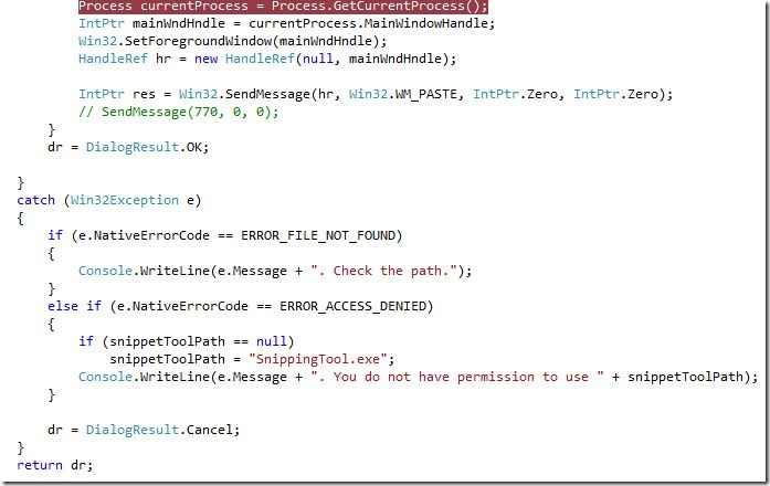
Here is what it looks like on my machine:
Before consolas:
With consolas:
According to Microsoft:
Consolas is intended for use in programming environments and other circumstances where a monospaced font is specified. All characters have the same width, like old typewriters, making it a good choice for personal and business correspondence. Optimizing the font specifically for ClearType allowed a design with proportions closer to normal text than traditional monospaced fonts like Courier. This allows for more comfortable reading of extended text on-screen.
The package will change the default text face in Visual Studio to the Consolas family.


No comments:
Post a Comment